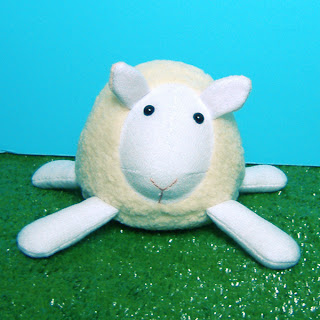

Sometimes you think things are looking pretty good. Then you realize that you were sadly mistaken. Fat Sheep is a good example of this. I originally based the design of the sheep from the design of the moose - same basic shapes with ears instead of antlers. Then, recently, I was looking at the portrait of a sheep that is hanging in our kitchen (yes, we have animal portraits in our kitchen) and noticed that the sheep's nose should really be its entire face!
So... I made the modifications and so far it's been a success. A few sheep are going into a store in Groton, MA and I had an order for two sheep the day I posted the new design in my Etsy shop.
Compare the two and see the difference (blue is old, white is new). Oh, and I still offer them in all colors, these are just the photos I had at the moment.
Original Design: March 2006 | Redesign: June 2007
Sometimes it just takes hearing "Is that a sheep? If so, it's pretty cute!" so many times that something must be done to make it recognizable. :)


2 comments:
Soooooo CUTE!!
The revision is perfect; very cute and recognizable! :)
Post a Comment